By Aditi Dahagam, Co-Web Content Editor
Students relax on bleachers in a pencil case, attend class inside a laptop and swim on a calculator screen on senior Olivia Wang’s 2020–2021 Program of Studies cover. Wang merged elements from previous covers to create a design that reflects the school, students and trends.
Wang first learned of the opportunity to design the Program of Studies cover in November, when visual and performing arts department chair Amy Cruz mentioned it to the seniors in her studio art class. Wang and her peers submitted their design ideas to a OneDrive folder so the art department could send their picks to the administration who made the final decision. Cruz and Principal Amy Meisinger chose Wang as the final cover artist and notified her in early December.
“I was super excited (when I found out) just because I know that, at least for me, the cover art has been kind of a big deal, just because I’ve seen the past ones and they’re all so amazing,” Wang said. “I kind of wanted to also showcase my own ideas and voice to the Program of Studies.”
Wang found her passion for art from the private classes she took when she was young. At Conestoga, Wang furthered her experience by transitioning into the studio art program and drawing covers for The Folio, the school’s literary and art magazine.
“(My work from The Folio) is kind of how I got more interested in drawing covers, and I guess that resulted in me also being interested in drawing the Program of Studies cover,” Wang said.
Wang’s initial design had school supplies laid out on a desk, but Cruz and Meisinger wanted more social interactions between people and liveliness. Wang decided to incorporate ideas from previous covers with isometric design, a third-perspective style of art.
“I thought about last year’s cover, which was just a bunch of people, and then the year before that it was just school supplies, so I was like, ‘Why not just blend them together and maybe get little people in school supplies?’ which I thought would be super cute,” Wang said.
After choosing the basic elements, Wang added Easter eggs, including a drone for the business and tech department, the pioneer mascot, the play “Hamlet,” and a frog dissection. She also combined different hairstyles and skin tones with the typical clothing of students to ensure the cover represented Conestoga. The cover doesn’t have pandemic-related elements because Meisinger and Cruz wanted to leave that aspect behind and focus on what students missed out on this year.
“No one’s actually wearing a mask — I think Mrs. Cruz and Dr. Meisinger wanted to steer clear of that — so it’s kind of an opposite direction where everyone’s interacting with each other. This year has been super isolating, so it’s nice to have at least everyone interacting in the program of studies cover,” Wang said.
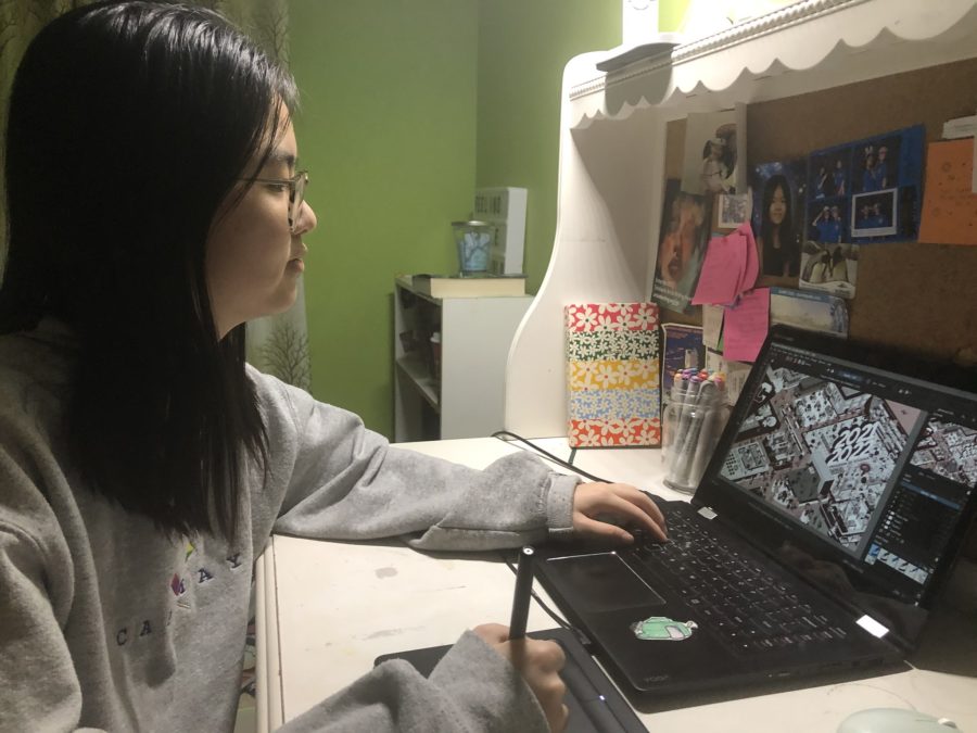
To facilitate the critiquing process, Wang and Cruz met weekly over Microsoft Teams to discuss design changes. Cruz believes the biggest change to the cover was the color palettes — Wang went through 10–12 different versions. Nonetheless, Cruz explains that she knew Wang would work hard to make a good design and be receptive to constructive criticism.
“When you’re working with a client, you also need to be open to feedback, and Olivia is not only open to feedback, but she loves that,” Cruz said. “She loves when people are discussing her work and giving feedback and making changes, so I think knowing that she would be open to that process is good as well.”
After spending roughly five hours per week on the design, Wang finalized the cover in mid-January. Wang believes creating the cover was a good opportunity to make a time capsule of the year and demonstrate her artistic abilities.
“Not only do we create art that’s tailored to Conestoga, but (designing the Program of Studies cover is) a good experience for the artist to draw something that’s according to a business partner,” Wang said. “It’s a good experience overall for the artist as well as the school.”


